

According to a study done by COLORBUX with respect to the colour wheel, there are certain colours that don’t look proper together. Their combination looks terrible.
Below are some offensive colour pairs you should avoid:
BROWN AND GRAY
There is no contrast between the two colours. Both have a similar amount of luminance, and thus, don’t have enough contrast to each other.
Additionally, both gray and brown resemble bodily colors too much, reducing the contrast to a person’s hair, skin, and eye color to a point where nothing is in the spotlight.
PURPLE AND YELLOW
These two colours might go well when it comes to decorations, but not when matching clothes, except you’re the Los Angeles Lakers.
These colors are too difficult to go along with each other, especially when you’re trying to create a look that flows naturally. This can be considered one of the hardest color combinations.
GREEN AND YELLOW
Anyone who has been using this combination, should just forget about it. The two colours are too bright to go together.
(Continuation of post below)[/vc_column_text]
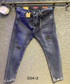
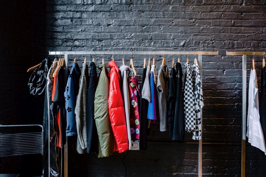
Jeans
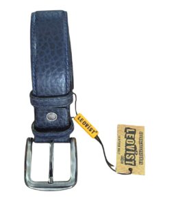
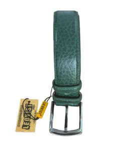
Accessories
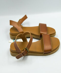
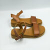
Sandals
WHITE AND SILVER
To many, this seems like a smart and wonderful idea, but in most cases, the clash between the two colours is so overwhelming. White and silver don’t pair well because they are too similar and don’t contrast. The outfit can only work if your skin can contrast enough with the dress.
MAGENTA AND RED
Whether you’re trying to wear a red shirt with a bright pink tie or a pretty magenta dress with red shoes, avoid pairing these colors together because it just looks bad. This is because Magenta is the brightest, most saturated version of the family of purple, and it lies two slots counter-clockwise to red on the color wheel.
Every color that lies two slots apart from any other and has similar brightness and lightness is going to clash.
GREEN AND ORANGE
This combo is an absolute no-no in clothing. Green and orange work terribly and clash heavily with one another. In most cases, you’ll want to choose two colors from the same color family in order for them to work well in a coordinating outfit, such as orange and brown or green and olive. But don’t mix both of these families together.
GREEN AND RED
Bright green isn’t a great color for clothing. It’s just too unusual. Anyways, green in combination with red just always gives off a Christmas vibe. Especially when you pair these two colors with white and/or gold of sorts, you will most certainly make anyone around you think of Christmas.
The best thing to do is to avoid combinations which you don’t understand. You might not be aware that they aren’t contrasting enough or are too similar and have a wrong distance on the colour wheel. Experts would explain this concept to you better.[/vc_column_text]
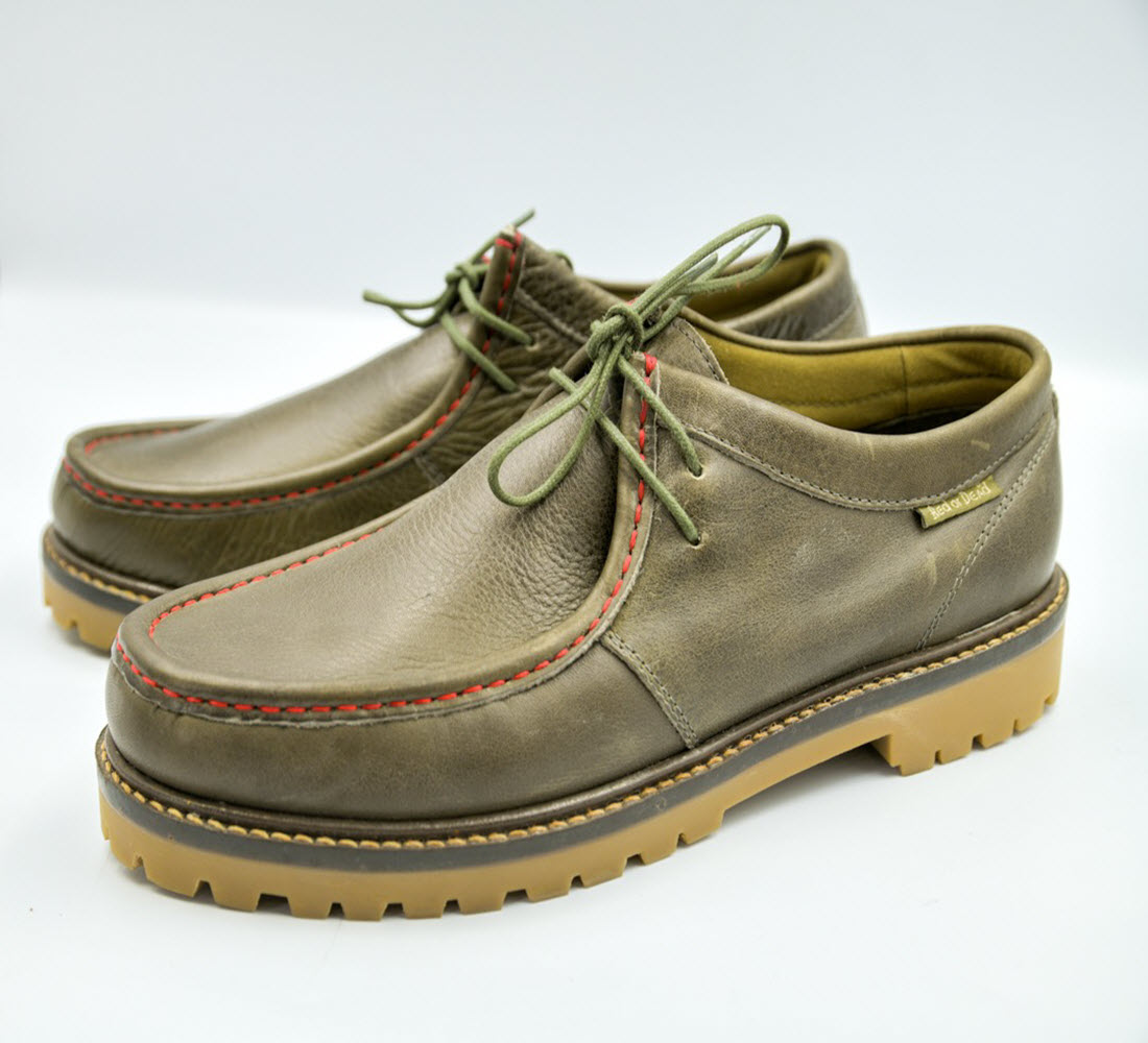
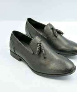
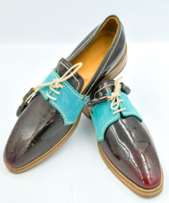
Classic men genuine lace up flat soled British style leather dockside.
| size | 44 |
|---|
Be the first to review “Men British style leather shoes”
Related products
Clothing
Leather
Sandals
Clothing
Boots
Lace up
Reviews
There are no reviews yet.